
Mobile Navigation Mistakes That Cost Clients
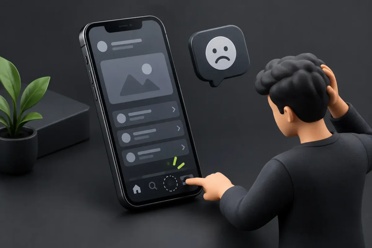
Someone lands from Instagram, looks for a service, taps the menu, and runs into tiny options, confusing submenus, or a button that doesn't respond. A few seconds later, they're gone. In a design meeting, mobile navigation mistakes rarely look serious, but they show up in the numbers: fewer leads, fewer bookings, and more ad budget wasted.
For many businesses, the phone is now the first place people meet the brand. That's where your customers compare, ask questions, request a quote, and decide whether to keep going or close the tab. Well-planned mobile navigation turns that intent into action; poor navigation cuts it off halfway.
Why Mobile Navigation Mistakes Hit So Hard
On desktop, people have room to explore: they see the full menu, scan several sections, and open pages in new tabs without much effort. On a phone there's less space, less patience, and more interruptions, so navigation has to make priorities clear from the first tap.
And the impact goes beyond looks. When the site architecture is hard to follow, visitors can't find services, projects, reference pricing, or a way to get in touch. They don't think "this site is badly organized." They think your company is making things hard for them.
That hits sales directly. A campaign can bring in quality traffic and still lose it if the navigation tangles the path to the form, WhatsApp, or the booking system. Premium web design should help people decide, not get in their way.
7 Mobile Navigation Mistakes Worth Fixing
1. Keeping the Desktop Menu, Just Smaller
A horizontal menu with lots of categories can work on a wide screen. Squeezed onto a phone, it almost never does: labels wrap, items crowd together, and visitors have to aim carefully with a fingertip.
Hiding everything behind an icon without a plan doesn't fix it either. Start by deciding which paths matter most. For a service business, clear links to Services, Projects, About, and Contact are usually enough. If there's one key action, like booking a call, give it a visible spot without repeating buttons everywhere.
2. Using Creative Labels Nobody Understands
Brand personality helps, but your menu shouldn't be a riddle. Labels like "Universe," "Flowing Solutions," or "What We Do Differently" sound good in a pitch deck and force people to guess before they tap.
In navigation, clarity wins. "Services," "Portfolio," "Resources," and "Contact" are labels anyone recognizes instantly. Save the creativity for microcopy, animation, and page content; the menu's job is to orient.
3. Burying Key Pages Under Too Many Levels
On a phone, a dropdown full of categories, subcategories, and extra links eats attention. Every added level raises the odds that someone gets lost or gives up, especially first-time visitors.
Not every site needs the same depth. A firm with dozens of services may need groupings; a company with three business lines doesn't need a corporate-sized structure. The practical rule: pages that help you sell or build trust should sit one or two taps away.
4. Making Tap Targets Too Small
A cursor forgives mistakes; a thumb doesn't. Crowded links, tiny icons, and narrow buttons cause mis-taps and a frustration nobody reports to you, but it still lowers how people judge your brand's quality.
Give every interactive element room, designed for one-handed phone use. That includes the menu button, dropdown links, the search field if you have one, the language switcher, and the close button on pop-ups.
5. Disorienting People When the Menu Opens
Mobile menus often cover the whole screen without showing where the user is or how to get back. If the logo disappears, the close button is unclear, or the page behind gets stuck with odd scrolling, the experience feels improvised.
The menu should open and close predictably. A clear close icon, a consistent visual state, and controlled scrolling change how the site feels to use. On sites with long sections, it also helps to keep the brand or the current page name visible.
6. Relying on Animations for Navigation to Work
Good animation lifts an interface. Trouble starts when it delays access to links, blocks scrolling, or breaks on less powerful phones. If you have to wait two seconds for a transition every time you open the menu, that transition is costing you customers.
Use animation to reinforce hierarchy and give a sense of control. Test it on real mobile data and mid-range phones, not just on the design team's fast laptop.
7. Ignoring Speed and Loading States
Navigation that looks flawless in a mockup stops being flawless when it's slow to respond. Heavy videos, unnecessary libraries, unoptimized images, or third-party scripts can make the menu seem frozen, and users won't stick around to find out why.
Webflow and Framer let you build very polished interfaces, but the result depends on how the project is implemented. Optimizing assets, trimming unnecessary effects, and reviewing integrations help you keep the site fast. A menu that responds instantly is part of good navigation too.
How to Design Navigation That Drives Conversions
Before you pick icons or transitions, define the most valuable action on your site: requesting a proposal, booking a consultation, reserving a room, or donating to a cause. That answer decides what shows up first and what can sit one level down.
Then map the journey by visitor intent. Someone coming from Google looking for a specific service shouldn't have to go back to the homepage to figure out what to do. Someone coming from social media may need proof first, like projects, testimonials, or a concrete explanation of the offer. Good navigation handles both paths without cluttering the screen.
Keep the main menu separate from your calls to action, too. The menu organizes information; the button pushes the next step. When everything looks equally important, nothing stands out. One well-placed button with a specific message, like "Request a Proposal" or "Book a Call," usually outperforms five generic "Learn More" buttons. For more on this, see how we approach conversion-focused UX/UI.
Test the Site the Way a Customer Uses It, Not the Way the Team Designed It
Your team knows every page by heart, so it notices less friction. A useful test: ask someone who wasn't involved in the project to complete specific tasks on their phone, like finding a service, viewing past work, requesting information, and going back to the previous page. Watch where they hesitate, what they tap first, and what they don't understand.
Also check different screen sizes, browsers, and network conditions. A design can look perfect on a new iPhone and behave differently on Android or a weak signal. Accessibility counts here too: good contrast, readable text, visible focus states, and screen reader support widen your site's reach.
Analytics complete the picture. If a page gets lots of mobile visits but people drop off before the form, don't assume the sales message is the problem. Look at clicks, scroll depth, exits, and the most common paths. Sometimes the highest-impact fix is as simple as cutting options or making a key action visible. A conversion rate optimization (CRO) engagement starts from exactly that analysis.
If your mobile menu makes people search, guess, or zoom, that's a quick win waiting. Book a 30-minute call and we'll review your site's mobile navigation together.