
Why My Website Isn't Converting and How to Fix It
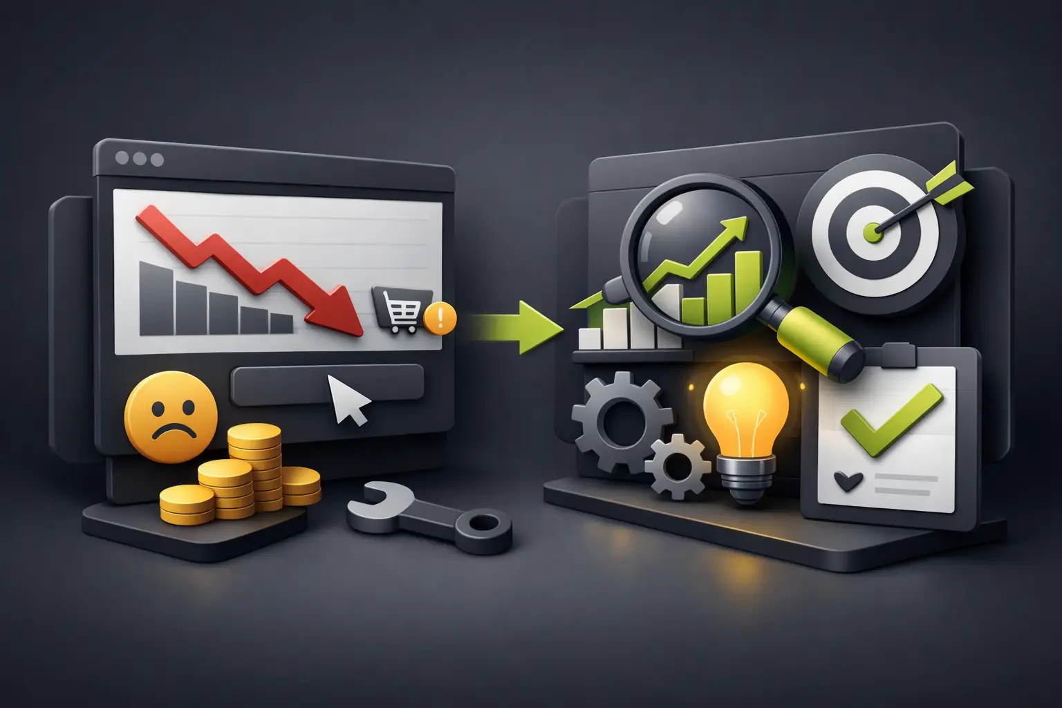
There are sites that look good, load acceptably, and even receive visits, but they don't generate inquiries, bookings, or sales. If you're asking yourself why my website doesn't convert, it's almost never due to a single error. Usually it's a sum of small frictions: a weak message, a confusing structure, an unclear offer, or an experience that forces the user to think too much.
That's the uncomfortable point of many business websites. You invest in design, publish content, run ads, but the site doesn't quite move the user toward action. And a website that doesn't convert isn't just a marketing problem. It's a digital asset that's working below its potential.
Why My Website Doesn't Convert Even Though It Gets Traffic
Receiving visits doesn't mean having purchase intent. Sometimes traffic comes from very broad campaigns, poorly qualified keywords, or social media where people arrive out of curiosity, not with a decision already made. Other times the right audience does arrive, but the page doesn't give them enough reasons to move forward.
Conversion happens when three things align: the right user, the right promise, and a frictionless experience. If one of those pieces fails, the result shows up quickly in the numbers. Lots of visits, few leads. Lots of clicks, little action.
There's also a matter of expectations. If the ad promises one thing and the page shows another, continuity breaks. If the design looks premium but the text is generic, there's distrust. If the service seems good but it's unclear what comes next, the user loses interest. Conversion doesn't depend only on looking professional. It depends on guiding with clarity.
The First Failure: Your Proposal Isn't Understood in Seconds
Most users decide very quickly whether to stay or leave. They don't read the entire website to discover what you do, who it's for, or why they should choose you. They scan, compare, and make a decision in seconds.
If the main heading is pretty but vague, you've lost a critical opportunity. Phrases like "we create digital experiences" or "innovative solutions for your business" sound good, but they don't sell on their own. They don't explain the result, don't filter for the ideal customer, and don't answer what problem you solve.
A website that converts usually makes clear, right from the top, what you offer, who you help, and what concrete benefit the customer gets. It doesn't need to exaggerate. It needs to be specific. A financial firm, an aesthetic clinic, or an architecture studio don't convert the same way, because their users arrive with different questions and need different answers.
Clarity Sells More Than Decoration
Strong visual design adds a lot, but it can't carry all the weight. If the user has to interpret too much, the page loses commercial power. Polish helps. Clarity converts.
The Real Bottleneck: Too Much Friction
Many websites fail not because they lack information, but because they complicate the decision. Long forms, saturated menus, hidden buttons, dense text, aggressive pop-ups, or competing calls to action. Each friction point takes momentum away from the user's intention.
An effective page doesn't force you to think about what to do next. It suggests it naturally. If you want people to write to you, the path must be obvious. If you want them to book, the next step should look simple. If you want to sell a high-value service, the page should build trust before asking for contact.
Here's a key detail: fewer options don't always mean better experience, but too many options almost always reduce conversions. When everything looks important, nothing stands out.
Why My Website Doesn't Convert If It Looks Professional
Because looking professional doesn't guarantee the site is designed to convert. There are visually flawless pages that function more like portfolios than commercial tools. They focus on impressing, not on pushing a specific action.
This happens a lot when design is thought from the brand perspective and not from user behavior. Brand matters, of course. A lot. But if the structure doesn't match the intention of the visit, the site stays in presence, not performance.
A simple example: a service company can have a flawless visual identity, polished photos, and elegant animations, but if it doesn't explain its process, doesn't show proof of trust, and doesn't answer basic objections, the user delays the decision. And what gets delayed almost always gets lost.
Trust Signals That Often Go Missing
Conversion needs credibility. It's not enough to say you're good. The website has to prove it quickly and credibly.
Specific testimonials, real cases, metrics, client logos, certifications, before and after, result screenshots, or a transparent explanation of your process make a huge difference. When these signals aren't there, the user fills the gaps with doubt.
Consistency also matters. If the homepage promises premium quality but inner pages feel incomplete or careless, noise is created. If the form looks improvised or the site fails on mobile, the perception of risk goes up. In businesses where the ticket value is high, that perception weighs more than many think.
The User Doesn't Always Object, They Just Leave
That's one of the most expensive problems in digital. Most won't explain why they didn't convert. They won't send a message saying the site made them distrust it or that they didn't understand the offer. They simply close the tab and keep comparing.
The Right Message Depends on the User's Stage
Not all visitors arrive ready to buy. Some are just understanding their problem. Others are already comparing providers. Others just want to validate that your company looks serious.
That's why a website that converts well doesn't speak the same way to everyone. It has message hierarchy. First it captures attention with a clear promise. Then it gives context, answers objections, and finally proposes an action proportional to the user's level of intention.
If you ask too much too soon, conversions drop. If you ask too little and never close, conversions drop too. There are services where it works better to invite a call. In other cases it's better to offer a quick quote, a demo, or a consultation. It depends on the level of complexity, the price, and the user's moment.
Design, Speed, and Mobile: The Real Impact
Technical experience remains decisive. A slow site, an unstable one, or one poorly adapted to mobile destroys conversions even if everything else is well thought out. And that's not a minor detail. In many industries, most traffic comes from mobile.
If on mobile the main button is hidden, the text feels endless, or the form feels like a chore, the loss is direct. The same happens with slow loading times. Each extra second cools intention and increases abandonment.
Here it's worth being honest: not every conversion problem is solved with speed or redesigning the interface. But when the technical foundation fails, any effort in ads, SEO, or content delivers less. The site has to respond quickly, look solid, and facilitate navigation. That standard is no longer optional.
What to Review Before Redesigning Everything
Sometimes the temptation is to throw out the entire website and start from scratch. In some cases you really do need to. In others, the problem is in specific points that can be fixed much more intelligently.
It's worth reviewing the main heading, the clarity of the offer, visual hierarchy, CTA quality, form flow, social proof, and mobile behavior. It's also good to look at heat maps, session recordings, and abandonment rates by page. Data usually shows where real intention breaks.
A good diagnosis doesn't start from personal tastes. It starts from behavior. It's not about whether the page "feels pretty," but whether it helps the user move forward without friction.
Conversion Improves When Each Section Serves a Purpose
Each block of the site should answer a question. What you do. Who for. Why trust. What's included. How long. What next. When a page is built with that logic, it becomes much more persuasive without sounding aggressive.
That's where serious execution makes a difference. A site built for high performance combines design, structure, speed, content, and strategy. It doesn't rely on generic templates or improvised decisions. It's built so the brand looks strong and, at the same time, so the business converts better.
In a market where every click costs and attention lasts seconds, your website can't be decoration. It has to operate as a real commercial piece. If today you feel something isn't working, you probably don't lack traffic. Maybe you lack a page designed to convert with intention, clarity, and precision.
And that's good news, because when the problem is understood well, improvement stops being luck and becomes strategy.