
How to Structure Your Website for Conversion
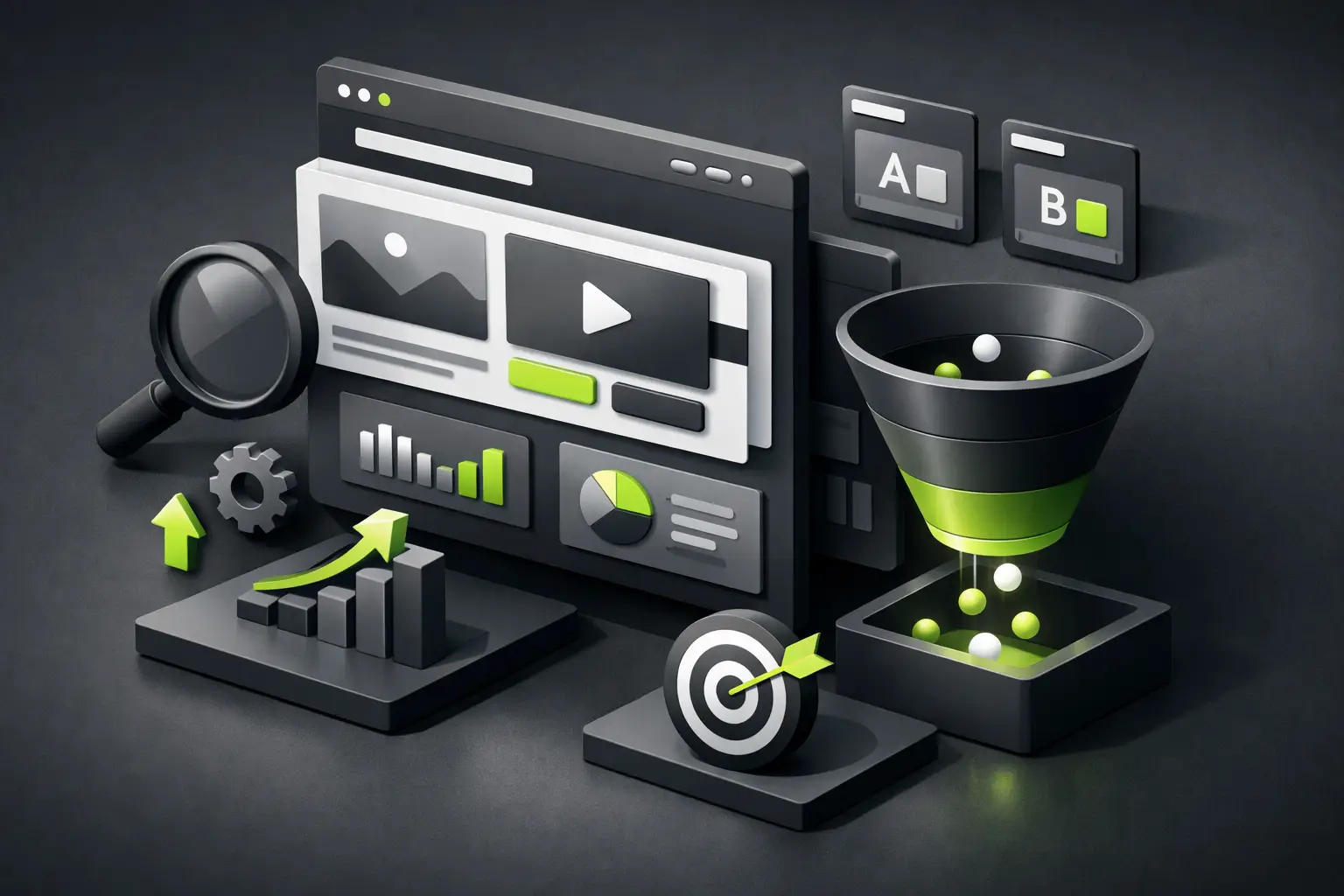
A website can look spectacular and still not generate a single inquiry. It happens more often than it should. The problem is almost never just the design. The problem is the structure. If you want to understand how to structure your website for conversion, you need to stop thinking about isolated pages and start thinking about user journey, intention, and friction.
A conversion-oriented structure isn't about scattering buttons everywhere. It's about guiding the right person toward a decision with the least amount of effort possible. That means order, visual hierarchy, clear messaging, and an architecture that answers a simple question: what does someone need to see to trust, move forward, and contact you?
What does it really mean to structure a website for conversion
Conversion doesn't always mean selling online. For an architecture firm it could mean scheduling a meeting. For a hotel, receiving more bookings. For a service company, generating qualified leads. For a personal brand, getting requests or partnerships. Conversion changes depending on the business, but the structural logic remains the same.
A well-structured website reduces noise. It doesn't force visitors to guess what you do, who it's for, or what the next step is. When that's not clear in the first few seconds, the visit loses momentum. And when it does, it doesn't matter if you have elegant animations or a flawless color palette.
That's why the structure needs to address three levels at once. First, orientation: the person understands where they are. Second, value: they perceive why they should stay. Third, action: they clearly see what they can do next.
How to structure your website for conversion through architecture
Before designing, you define the route. This point is severely underestimated. Many companies start by choosing colors, sections, or visual references without having resolved the content architecture. The result is usually a beautiful but scattered website.
The basic conversion architecture almost always starts with a homepage that acts as a strategic entry point. It shouldn't try to tell everything. Its job is to organize your offering, filter audiences, and direct them to the pages that go deeper.
Then come the service or solution pages. These do most of the actual commercial work. If you offer several services, mixing them all on one page usually lowers conversion because it forces the user to exert too much mental effort. It's better to separate by intention. Someone looking for UX design doesn't necessarily want to read about branding or technical SEO first.
You usually also need a proof or trust page. Sometimes it's resolved with case studies, sometimes with testimonials, sometimes with featured projects. Not all brands need a giant portfolio section, but almost all need evidence. Trust rarely appears just from what you say. It appears from how you back it up.
And finally there's the contact or direct conversion page. Many websites fail here by overdoing it. Endless forms, too many options, or vague calls to action. If the user already made it this far, don't stop them with an interrogation.
The homepage doesn't sell alone, but it defines everything
The homepage has a critical task: confirm in seconds that the visit landed in the right place. That requires a direct headline, a specific value proposition, and a visible call to action. No clever phrases that could belong to any company.
If a firm says "we create memorable digital experiences," that sounds elegant but clarifies nothing. Instead, if it says it designs fast, personalized sites aimed at generating leads, there's already a concrete promise. The difference is in clarity.
After the first block, sequence matters. In many cases this order works better: customer problem or need, the solution you offer, concrete benefits, proof of trust, and next step. It's not a rigid formula, but solid logic. People don't buy features alone. They buy risk reduction, clarity, and results.
If your business works with different client profiles, the homepage can also segment. For example, direct service companies one way and personal brands another. That improves relevance and prevents your message from getting diluted.
Service pages are where conversion is won
If you want to improve results, review your service pages first. That's where good structure produces real impact. Each one should focus on a clear intention and answer concrete questions without detours.
A powerful service page typically starts with a specific promise, followed by a brief explanation of the problem it solves. Then it's good to show your approach, expected results, and differentiators. Next comes social proof or evidence. And at the end, a clear invitation to move forward.
What matters is that the content follows a logical progression. If you introduce technical details too early, you might lose someone who's still evaluating options. But if everything is too superficial, you also won't build trust. This is where judgment comes in. Not all audiences need the same level of depth.
In more technical sectors, like technology or finance, a structure with more precision and less decoration can work. In hospitality or personal branding, emotional and visual weight can be greater. The base structure doesn't change, but the emphasis does.
Visual hierarchy: the other half of conversion
Knowing how to structure your website for conversion isn't just about sitemap or copy. It's also about reading flow. If everything competes for attention, nothing stands out. A website that converts well guides the eye without the user noticing.
This is achieved with strong headlines, subheadings that land the idea, well-spaced blocks, and consistent calls to action. You don't need twenty different buttons. You need one or two clear paths, repeated at strategic moments.
It also helps to care for pacing. One very dense block can break momentum. A page full of micro-sections without depth also does. The best visual structure mixes speed with pause. It explains quickly what's essential and develops more where the decision needs it.
And yes, premium design helps. A lot. But only when it serves clarity. Animations, transitions, and visual resources should reinforce understanding, not distract. If the effect steals attention from the message, it's working against you.
Fewer options, more intention
One of the most common mistakes is wanting to address every scenario at once. Giant menu, multiple services not grouped, various audiences mixed together, different calls to action in each section. That doesn't feel abundant. It feels chaotic.
Conversion improves when you reduce unnecessary decisions. If you want someone to book, prioritize that action. If you want them to request a proposal, build the page around that. If your main goal is generating reservations, don't hide that path behind five clicks.
This doesn't mean eliminating useful content. It means placing it where it belongs. There's information that helps convert at an advanced stage but gets in the way early on. The correct structure respects that timing.
SEO and conversion must work together
There's an uncomfortable myth: that a page optimized for search engines and a page designed to convert compete with each other. Actually, when both are done well, they strengthen each other. A clear structure helps the user and also helps search engines understand the content.
Well-focused service pages usually perform better on both fronts because they target a specific intention. Plus, they allow for more precise messaging, more useful titles, and a more coherent experience from search to action.
That said, you have to avoid the extreme of writing only for ranking. If the text feels forced or repetitive, conversion drops. The goal isn't to stuff keywords by obligation. It's to build pages that answer better than others what the person came to solve.
That's where modern execution makes a difference. A fast, secure, visually polished, and easy-to-update site doesn't just look better. It also sustains commercial performance better over the long term. That's why platforms like Webflow or Framer make so much sense when the priority is speed, control, and quality without depending on heavy structures.
The ideal structure depends on your business
There's no single recipe. A clinic, a law firm, and a creative studio shouldn't structure their websites the same way. What changes is urgency, the type of objection, the decision timeline. What stays constant is the need for clarity.
If your service requires a lot of trust, social proof comes first. If your offering is new or poorly understood, you need to educate first. If the user arrives with high intent, it's worth reducing text and facilitating action. The correct structure always responds to the commercial context, not a design trend.
At Flow™ we see it all the time: when a brand organizes its message and architecture well, the website stops being a pretty brochure and becomes a real growth asset. That's where design gains creative superpowers, but with measurable results.
The best website isn't the one that says the most. It's the one that guides the best. If each section brings the right person closer to the next step, you're on the right track. And if your site feels confusing today, you don't need a huge redesign. Sometimes the most profitable change is simply structuring with intention.