
8 Key Elements of an Effective Landing Page
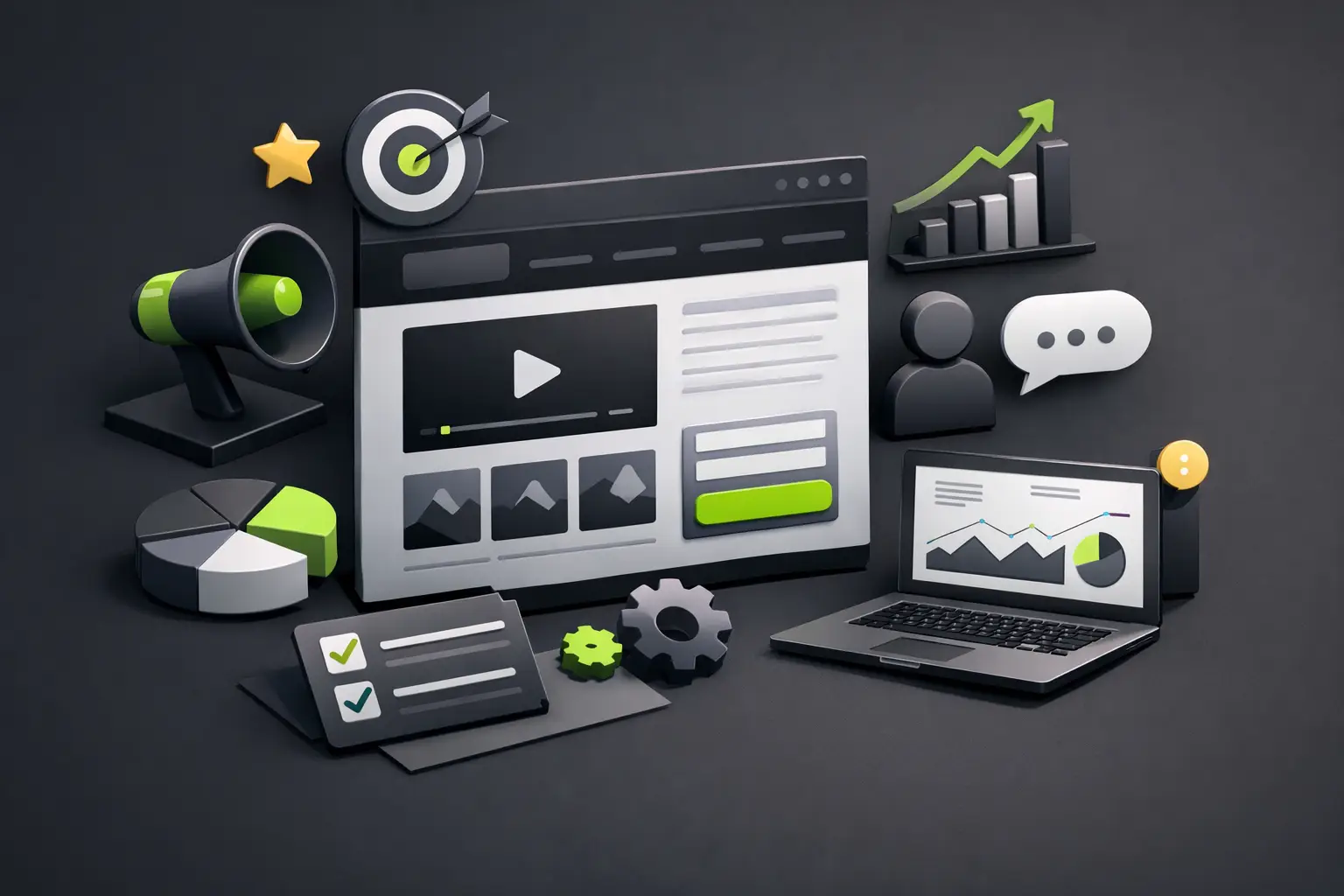
A landing page doesn't fail because of lack of traffic. It fails because it doesn't convert clearly. When a company invests in ads, SEO, or campaigns and drives people to a page that distracts, confuses, or takes forever to load, it loses money. That's why understanding the key elements of an effective landing page isn't a design detail: it's a business decision.
The good news is that a converting landing page doesn't depend on tricks. It depends on structure, visual hierarchy, speed, and a message that matches the user's intent. If someone arrives from an ad, a search, or an email campaign, they expect to find a quick answer to a specific need. If they have to guess what you're offering, you're already late.
What makes a landing page effective
An effective landing page reduces friction and builds trust. That's the game. It doesn't try to say everything or show the entire business in one view. It takes a concrete offer and presents it directly so the person moves to the next step.
That step might be scheduling a call, requesting a quote, downloading a resource, booking a demo, or completing a form. The important thing is that the page is designed around a single main conversion. When a landing page competes against itself with multiple messages, multiple buttons, and multiple routes, performance drops.
This is where many brands complicate things. They want a beautiful page, a modern page, and a page that represents their brand. All of that matters. But if aesthetics trump clarity, the experience loses power. Premium design works better when it guides attention, not when it scatters it.
Key elements of effective landing pages that actually drive results
1. A value proposition that's understood in seconds
The main block of the landing page needs to answer three questions almost immediately: what you're offering, who it's for, and why it's worth it. If the headline sounds creative but doesn't say anything concrete, the page starts weak.
A good headline doesn't try to impress. It tries to orient. For example, there's a difference between saying "We transform your digital presence" and "Web design focused on conversion for businesses that need to generate leads faster." The first phrase sounds nice. The second sells better because it grounds the benefit.
The subheading does the fine work. There you can add context, address objections, or reinforce a promise of speed, savings, control, or results. If your service has a clear competitive advantage, this is the place to show it.
2. A visible and consistent call to action
Every landing page needs a main CTA that stands out effortlessly. Not ten. One main CTA, repeated consistently throughout the page. If you say "Schedule a consultation" at the top and later change to "Request information" and then "See plans," you start fragmenting intention.
The CTA should be aligned with the temperature level of your traffic. If someone is just getting to know you, asking for an immediate purchase might be too aggressive. In that case, a demo, a short call, or an assessment might work better. If they're already coming from a high-intent campaign, you can be more direct.
Context also matters. A strong button over contrasting background helps, but it doesn't replace a poorly framed offer. The problem is rarely just the button color.
3. Message aligned with the traffic source
One of the most underestimated key elements of effective landing pages is message consistency. If an ad promises a free audit and the landing page talks about branding, there's friction. If a campaign emphasizes speed and the page opens with generic text about innovation, the expectation breaks.
Consistency between ad, keyword, email, or post and the landing page content improves conversion because it reduces confusion. The person feels they've arrived at the right place. It might seem obvious, but many pages lose opportunities right here.
This also applies to SEO. If someone searches for a specific solution, the landing page needs to answer that intent with precision. It's not enough to stuff keywords. You need to structure content around the real problem.
4. Visual hierarchy that guides, not adorns
Good design isn't decoration. It's direction. An effective landing page uses size, contrast, spacing, visual rhythm, and images to guide the eye along the correct path.
That means the headline should dominate the first screen, the CTA needs to be visible quickly, and the following blocks should deepen the decision. If all elements compete for attention, none wins. Animations, for example, can elevate perceived quality, but if they slow load times or distract from the goal, they come at a cost.
There's a fine balance between visual impact and performance. For premium brands, that balance matters even more. The page should look solid, current, and well-executed, but with clear conversion logic behind it.
5. Trust signals at the right moment
People don't convert just because they understood your offer. They convert when they feel enough security to move forward. That's why social proof and trust signals should appear before major doubts arise.
Testimonials, client logos, numbers, real cases, certifications, or experience indicators can help a lot. But it's not about filling the page with badges. It's about using credible and relevant evidence.
If you sell professional services, a specific testimonial usually performs better than a generic phrase like "excellent service." If you offer web development, showing results like delivery speed, lead increase, or content management ease carries more weight than just talking about beautiful design.
6. Less friction in forms and contact steps
Each extra field in a form is a small barrier. Sometimes it's worth asking for more information to better filter leads. Sometimes that decision drops conversion volume too much. It depends on the type of service, the price, and how much commitment you want before selling.
If you're offering a first conversation, ask for the minimum reasonable. Name, email, and a brief description of the need might be enough. If the promise is a detailed quote, maybe you do need more context. The important thing is that the person's effort is proportional to the value they receive.
It also helps to explain what happens next. A simple message like "We'll contact you in less than 24 hours" reduces anxiety. Uncertainty drops conversions more than many people realize.
7. Speed, mobile, and flawless technical experience
You can have an excellent offer, strong visual identity, and well-crafted copy. If the landing page takes forever to load or breaks on mobile, performance plummets. That simple.
Today much traffic comes from mobile, especially from campaigns and social media. The landing page needs to feel fast, clean, and easy to use with your finger. Clear buttons, readable typography, comfortable forms, and sections that don't force zooming.
Speed also affects perception. A fast page transmits professionalism, order, and trust. A slow one transmits friction. In a market where decisions are made in seconds, that detail has direct impact on sales.
8. Content focused on decision, not filler
Many landing pages add blocks because "they always go there." A carousel here, a gallery there, three paragraphs about company history, an entire section that doesn't serve the goal. Each block should justify its place.
The ideal sequence isn't always the same, but this flow usually works: value proposition, main benefit, evidence, how it works, objections, and CTA. If a block doesn't move closer to conversion, it probably doesn't belong or needs to change form.
It also helps to write thinking about scanning. Nobody arrives at a landing page wanting to read a thesis. Reading should feel light, even though the strategy behind it is sophisticated. Precise phrases, clear benefits, and a structure that allows quick understanding.
What usually sabotages a landing page even when it looks good
There are mistakes that disguise themselves as best practices. One very common one is trying to say too much. Another is copying external structures without adapting your own offer. It also happens with pages that use elegant but empty language. They sound premium, but they don't answer any user questions.
Another frequent problem is measuring too little. An effective landing page isn't born perfect. It adjusts. Sometimes the problem is the headline. Sometimes it's the offer. Sometimes it's the quality of traffic. Changing the button without reviewing everything else rarely fixes the root issue.
That's why it helps to look at the landing page as a system. Design, copy, speed, UX, and traffic source work together. When one piece fails, the complete result suffers.
An effective landing page doesn't sell by accident
Brands that convert best aren't always the ones that talk the most. They're the ones that communicate with precision and build a frictionless experience. That's where design stops being just appearance and becomes a business tool.
If your landing page has a clear offer, a well-aligned message, a fast experience, and trust signals at the right points, you already have a solid foundation to grow. And if it's also built with visual criteria, content control, and technical performance, even better. That's the kind of digital asset that doesn't just look good: it works for your brand every day.
Next time you review a landing page, don't ask yourself first if it looks modern. Ask yourself if it moves the person forward with clarity and confidence. That's where real conversion starts.