
10 Common Web Design Redesign Mistakes That Cost You Leads
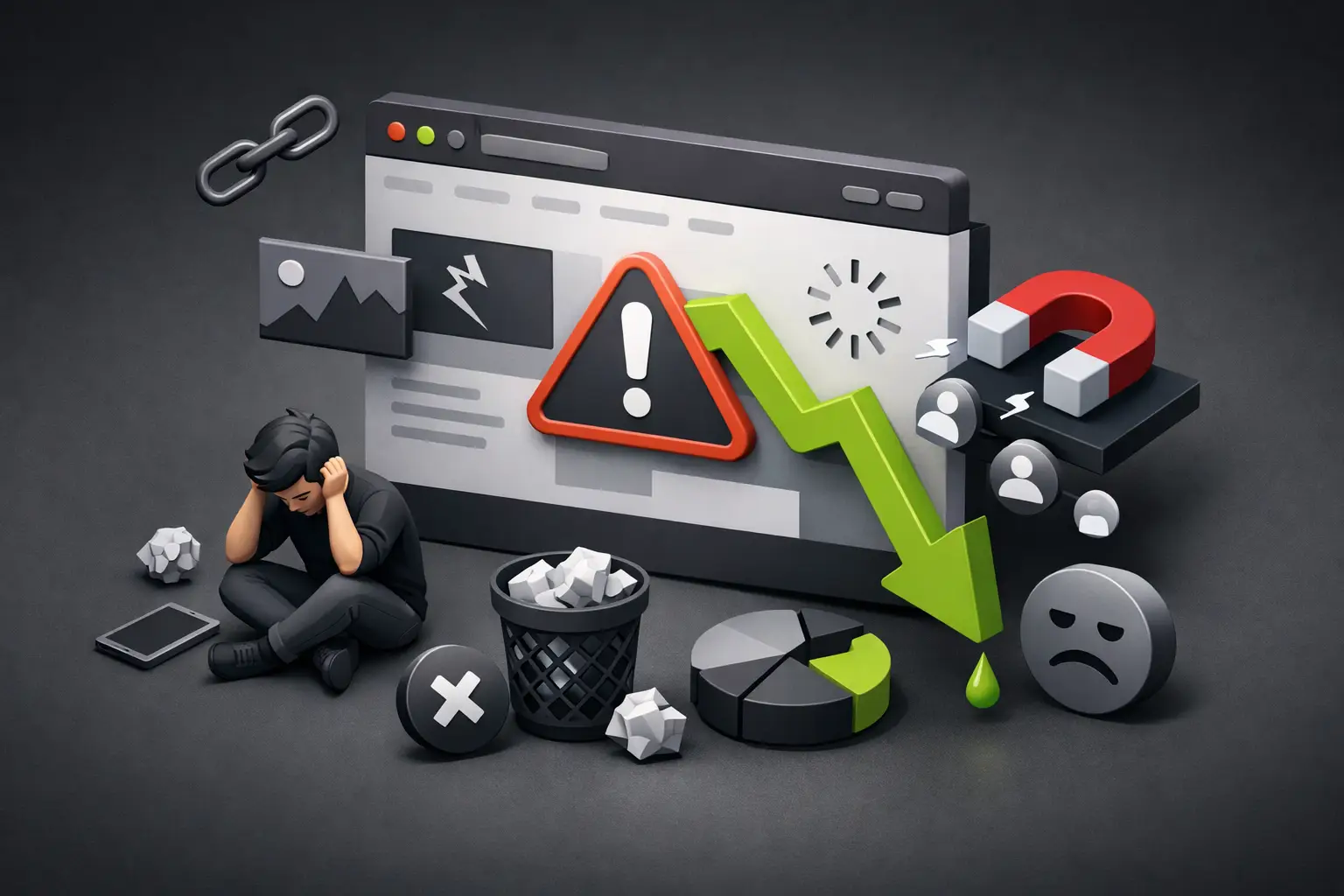
A site can look much more modern and still sell less. That's the real cost of common web design redesign mistakes: visually attractive decisions that break conversion paths, eliminate SEO authority, or make it harder for customers to find what they need. For a business, redesigning shouldn't be about changing colors. It should be about improving a business asset.
A new website needs to load fast, explain its value in seconds, make contact easy, and give your team control to update content. When the project starts with those goals, design stops being decoration and becomes a competitive advantage.
1. Redesigning for aesthetics, not a business goal
"It looks old" can be a valid signal, but it's not a strategy. Before moving a single section, you need to define what should improve: more form submissions, more bookings, more quote requests, better brand perception, or greater organic visibility.
Without a goal, every conversation becomes opinion-based. One team wants more animations, another prefers a shorter page, and someone suggests copying competitors. The result is usually a site full of compromises, but without direction.
Define one primary metric and two or three supporting metrics. For example, an architecture firm might prioritize meeting requests, while a hotel might focus on direct bookings. Design, calls-to-action, and structure should respond to that priority.
2. Ignoring what already works
One of the most costly mistakes is deleting pages, text, or paths without reviewing data. Maybe an unassuming service page receives high-intent traffic. Or perhaps an old article attracts visits from Google and AI tools because it answers a very specific question your customers are asking.
Before the redesign, it's worth reviewing pages with the best organic traffic, the search queries that activate them, the links they receive, and the form submissions or clicks they generate. It's also valuable to study behavior maps, internal searches, and frequently asked questions coming through WhatsApp or sales.
It's not about keeping everything. It's about distinguishing between content that's in the way and content that already has commercial value. A good migration improves what's valuable instead of sacrificing it for new aesthetics.
3. Changing URLs without a redirect plan
A URL seems like a technical detail until it disappears from search results. If you change your site architecture and old pages return errors, you lose traffic, accumulated authority, and in some cases, active campaigns pointing to those addresses.
Every URL that changes needs a 301 redirect to the most relevant new page. It's not enough to send everything to the homepage. If someone was searching for a service, a solution, or a specific category, they should land on an equivalent answer.
You also need to update internal links, sitemap, canonical tags, and paid campaigns. This stage is not optional: it protects the SEO work your business already paid for with time, content, and investment.
4. Prioritizing animation over clarity
Elegant animations can elevate brand perception. With Webflow and Framer, you can create polished experiences without relying on a generic template. But an animation only adds value if it guides attention, explains an idea, or reinforces an action.
When everything moves, nothing stands out. Text that appears too slowly, complex menus, heavy effects, and autoplay videos can increase friction, especially on mobile or with less stable connections.
The first screen should quickly answer three questions: what the company does, who it does it for, and what's the next step. If the visitor needs to scroll or wait to understand it, your value proposition is hidden.
5. Designing for desktop and reviewing mobile at the end
In Costa Rica, many first visits come from a mobile device. Yet there are redesigns that get approved on a large screen and only adjusted for mobile when there's no time or budget left.
This shows in hard-to-tap buttons, long forms, enormous headlines, uncomfortable menus, and sections that force excessive scrolling without delivering information. A mobile version isn't a shrunk copy of the desktop: it needs its own hierarchy, space, and decisions.
Review the site on real devices. Test completing a form, opening the menu, requesting a quote, and reading text in natural light. The goal is for the experience to feel fast and direct, not just "work".
6. Leaving SEO for after launch
SEO isn't added at the end as a layer of keywords. It starts with architecture: what pages exist, how they're named, what search intent they cover, and how they connect to each other.
A well-planned redesign preserves useful titles and descriptions, correctly orders headings, optimizes images, maintains coherent URLs, and creates pages focused on real services. Plus, it uses clear and verifiable content, easy to interpret by both traditional search engines and AI-assisted search experiences.
There's a balance here. You shouldn't saturate a page with repeated phrases or write for a robot. You should speak precisely about problems, processes, results, and industries served. That clarity helps you rank and, more importantly, helps you convert.
7. Hiding calls-to-action
A visually polished site can fail if it leaves the visitor thinking, "What do I do now?". The form shouldn't only live at the end of an endless page, and the contact button can't compete visually with ten secondary actions.
Each page needs a logical next step. It could be scheduling a meeting, requesting a proposal, seeing case studies, or checking availability. The action depends on your sales cycle: a complex service might require a conversation, while a hospitality experience might drive an immediate booking.
The key is reducing uncertainty. Explain what happens when they submit the form, how long the response takes, and what information the user needs to provide. A clear call-to-action generates more trust than a generic button that just says "Send".
8. Using beautiful text that doesn't communicate value
Phrases like "innovative solutions" or "excellence service" sound right, but they could belong to any company. In a redesign, copy needs to do the heavy lifting: explain the problem your brand solves, what makes it different, and why to act now.
Instead of claiming your team offers quality, show how you work, what you deliver, and what type of client you serve. Instead of saying your product transforms businesses, detail the concrete result: reducing timelines, improving visibility, increasing bookings, or simplifying an operation.
Your verbal identity should feel as personalized as your visual identity. That requires interviews, research, and judgment—not filling sections with filler text.
9. Choosing a platform that limits your team
A website can launch quickly and become a problem months later if no one can update a page, publish a case study, or change a campaign without asking for technical help. The redesign should consider who will manage content and how often.
A flexible CMS lets marketing keep the site fresh, while well-defined components protect visual consistency. Platforms like Webflow and Framer can offer launch speed and great creative freedom, but the choice depends on the project. A complex editorial site, a campaign page, and a platform with particular integrations don't have the same needs.
The right platform isn't the trendy one. It's the one that lets you grow without turning every adjustment into a slow, expensive, or risky task.
10. Launching without testing, measurement, or accountability
Publishing the site isn't the end of the project. It's when it starts receiving real traffic, real inquiries, and behaviors no mockup fully reveals.
Before going live, test forms, confirmation emails, links, mobile versions, speed, basic accessibility, and conversion paths. Set up measurement to know where leads come from, which pages help generate opportunities, and where users drop off.
After launch, assign owners. Someone needs to review inquiries, update priority content, and spot pages that need adjustments. A website without maintenance doesn't stay the same: it becomes less relevant compared to brands that actually publish, test, and improve.
A redesign should leave your business better prepared
The best redesign isn't the one that gets the most internal praise on launch day. It's the one that makes it easier for a customer to understand your proposal, trust your brand, and take the next step. With a clear strategy, careful migration, and premium execution, your website can become one of your company's most profitable creative and commercial superpowers.
If you're about to refresh your site, treat every decision as an investment in speed, visibility, and conversion. That approach is what separates a new page from a tool that truly drives growth.